Contents

Welcome to Elementor

Elementor is a visual website builder plugin for WordPress enabling the creation of web pages in a live, visual way. 

When building websites with Elementor you should always keep in mind that this builder is both responsive and adaptive. That means, always start building from desktop first.


How to use Elementor

Elementor has some unique features which make building a website in WordPress faster. Some of those features are: the Finder, the Navigator, History States and many more.


Elementor panels overview

Elementor has some unique features which make building a website in WordPress faster. Some of those features are: the Finder, Navigator, History States and many more.

The Finder

Elementor Finder is a search bar that gives quick access to various areas across your site, within one window. You can use the finder to:

  1. Navigate to a different Page or Template
  2. Create A New Page, Post, Template, Product, etc.
  3. Go to other areas of your site (Menus, Popups, etc, even the Knowledge Base)

To access it you have to either click the hamburger icon Hamburger Icon or press, on your keyboard:

  • CMD + E (Mac)
  • CTRL + E (Windows)


Navigator

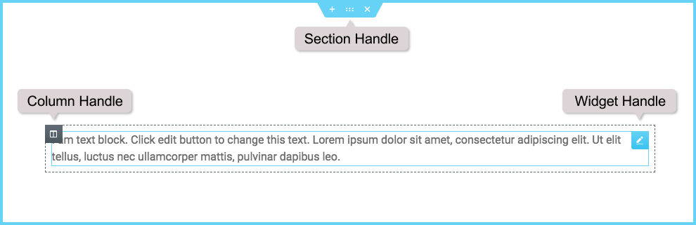
Navigator is a navigation tree panel providing easy access to every element on the editor with just one click.

Navigator is particularly useful for long pages or pages with complex multi-layered design, and for elements combining Z-Index, minus margin, position absolute, etc. It allows you to access element handles that may be positioned behind other elements.

You can access Navigator in one of 3 simple ways:

  1. Right-click any element and then click on Navigator. This will automatically redirect you to the specific element in the navigation tree.
  2. Click on the elements button  Navigator Icon in the panel’s footer.
  3. Use the Cmd/Ctrl + I keyboard shortcut.


History, Actions and Revisions Tab

Elementor includes a built-in Undo and Redo, as well as Revision History. With these features, you get a log for every action and save made on the editor.

To access the History panel, click the icon History Icon at the bottom of the Widget Panel.

This will open the History panel, that includes Actions and Revisions.
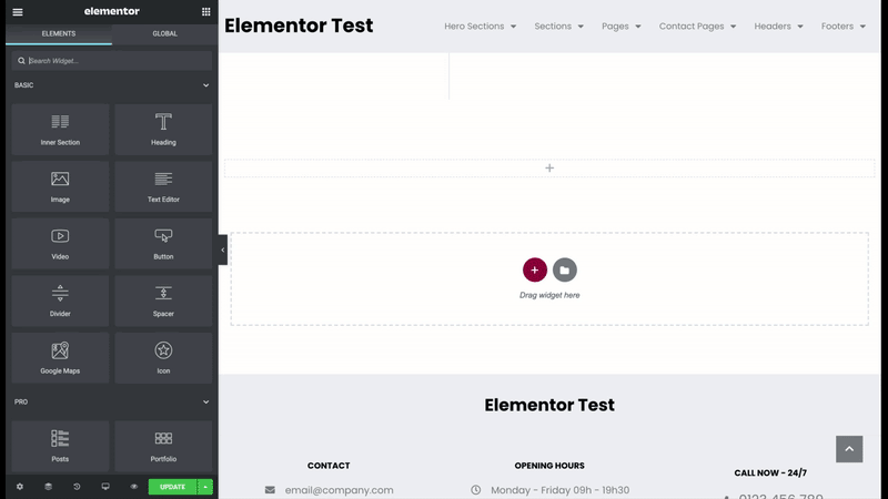
The Actions Tab

The Actions Tab logs every ‘action’ you make in Elementor.

Browsing and clicking on the Actions list will let you trace back your steps. You can move back and forth between actions.

Each item on the Actions list includes the name of the element and the type of change, whether it is an addition or an edit.

! Note: Actions are available from the moment you navigate to a page and start making change on that current page. If you navigate to a different page, the actions will be reset and start again when you start making changes on the current page.

The Revisions Tab

Every time a page updates, a new revision is created.

You can switch between revisions and revert back to any previous one saved.

Each revision item lists the date, time and creator of the revision. Click on Apply to apply the revision on the current page. Click on Discard to return to the current version of the page.

Important! This feature is available ONLY for IOL WordPress environments. Unfortunately, it is not available for the demo websites.

Keyboard Shortcuts​

Useful hotkeys

Elementor Hotkeys are keyboard shortcuts that let you make quick actions on the Elementor editor.

  • CTRL + S (Windows) or CMD + S (Mac) to save your work
  • CTRL + P or CMD + P to switch between the panel and preview view
  • CTRL + SHIFT + M or CMD + SHIFT + M to switch between desktop, tablet and mobile views
  • CTRL + SHIFT + H or CMD + SHIFT + H to go to the Revision History panel
  • CTRL + SHIFT + L or CMD + SHIFT + L to open the Template Library

Undo / Redo Keyboard Shortcuts

You can also use:

  • CTRL + Z (Windows) or CMD + Z (Mac) to undo your last action
  • CTRL + SHIFT + Z or CMD + SHIFT + Z to redo your last action.


Build your page

Elementor uses three main building blocks: Sections, Columns, and Widgets.


Sections

Sections are the largest building blocks, they are the equivalent of a row for web design. Inside them are groups of Columns. Columns sit inside of Sections and are used to house the Widgets. Widgets are placed inside of Columns.

You control the Section, Column, and Widgets with their handle.

To create from scratch a section click Create simple section icon and select your column structure.

To use the Spotzer Sections Library, click the Add template icon. You can chose from a wide variety of design elements, like USP’s, POD’s and many more. 

Columns

Columns can be manipulated and styled either via the options in the Elementor Panel on the left or by right-clicking the Column handle and choosing from the context menu that pops up.

Right-Click Options

If you wish to add a new column/section/widget or duplicate a column/section/widget, right-click a column handle and choose either Add New Column or Duplicate from the context menu.

You can also copy and paste a column/section/widget into another section using Copy and Paste options here.

Or you can copy and paste only the style (without the content) from one column/section/widget to another.

Clicking Navigator here will open the Navigator already set to that particular column. And of course, clicking Delete here will delete the column.

Step 1: Setting Up Colors, Fonts and Color Picker

Create your own design system with global colors and text styles that can easily be assigned to elements across your site.


Global Colors

Set predefined global colors. By default, the predefined colors:

  • Primary
  • Secondary
  • Text
  • Accent


are pre-populated from your theme’s CSS.  Change them here to override your theme’s settings.

In addition to the 4 predefined global colors (Primary, Secondary, Text, and Accent), you can add any colors you choose to the global palette, for use in any Elementor color options and also named them.

! Note: By deleting a global color, all of its instances will inherit their values from an unknown source, possibly your theme, or your browser, etc.

Theme Style – Global Settings

Theme Style settings are global settings that allow you to set default styling options for various elements, such as Backgrounds, Headings, Buttons, Images, and Form Fields.  These settings override the theme styling settings and takes its place, allowing you to use Elementor to set styles for elements not built by Elementor.

By default, this will apply styles only to non-Elementor elements, for example, WooCommerce checkout fields, Contact Form 7 labels, 3rd-party headings and much more. If you prefer, you can force these Theme Style settings to also apply to Elementor-built elements as well. 

1. How To Set Theme Styles

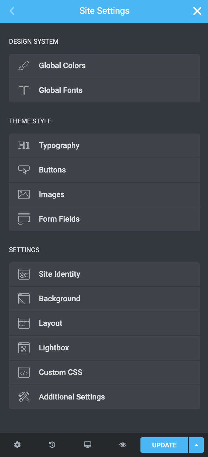
Click the Hamburger menu in the upper left corner of any page or post’s widget panel to access the Site Settings > Theme Style settings. 

Theme Style consists of four tabs: Typography, Buttons, Images, and Form Fields.

Typography: Text Color, Typography, Paragraph Spacing

Link (Normal | Hover): Color, Typography

Headers H1-H6:  Color, Typography

Buttons: Typography, Text Shadow, Normal | Hover, Border, Padding

Form Fields: Label, Field, Normal | Focus, Border, Box-shadow, Padding

Images: Normal | Hover, Border, Box-shadow, Opacity, Animations

2. To Apply Theme Styles To Elementor Elements:

In order for Theme Style settings to apply to most of Elementor’s elements and widgets as well, you will need to disable Elementor’s default colors and fonts.

  1. Disable default colors and default fonts by going to Elementor > Settings and placing a check in the boxes next to Disable Default Colors and Disable Default Fonts.

Step 2: How to add sections

Templates are pre-designed Pages & Blocks (POD’S, USP’S, CTA’S…) that can be inserted into any page with just one click.

  1. From the editing screen, Click the  icon.
  2. Click the magnifying glass icon magnifier icon to preview a template.
  3. Click INSERT to select the required template.

There are two ways of inserting the templates:

1. You can import it with the document settings of the template, which will overwrite all the global styles and the template will be imported with the original styling and customization.

2. You can import it without the document settings of the template, which will automatically update the template to the global styles preset in advance.

Step 3: How to save other sections for further use

You can save any section or even a full page as a template, which later can be imported and used on other pages, depending on the request. To do that:

  1. Right-click on , on the section you want to save 
  2. From the dropdown list choose “Save as Template”
  3. Enter the new section name and click “Save”

Step 4: How to use global widgets

A  Global Widget gives you full control over a specific widget that is displayed in multiple places on your site. Editing it in one place will instantly update the rest.

Create a Global Widget

  1. Right Click the widget’s handle pencil icon  and click on Save as a Global
  2. Name your new global template and click the Save button

Once the widget is saved as a global widget it is instantly surrounded by a yellow border instead of the standard blue border.

Edit a Global Widget

When trying to edit a global widget you will see the message “ This is a global widget and is now locked”

  1. Clicking Edit global widget allows editing the global widget. Any changes made here will instantly update all the places in which the global widget is placed on the site
  2. Clicking Unlink from global will unlink the widget from the rest of the global widgets, and let you edit only the specific widget, without affecting all other global widgets.

! Note: Remember to unlink all global widget before copy is being added to the website.

Insert a Global Widget

On the new page click Global, and drag a global widget to your page.

Delete a Global Widget

To delete a global widget, go to Templates > Saved Templates, and delete the widget.

Important! If you delete a Global Widget, you delete it from everywhere.

Step 5: Importing and exporting templates

Export templates

To export a template, go to Templates > Saved Templates, and select one or multiple templates and choose export. They will be exported as .json files which can later be imported for further use.

Import templates

You can import templates in two ways: via the Elementor Dashboard or in Saved Templates.

To import from the Elementor Dashboard, click the hamburger icon Hamburger Icon 

and go to Theme Builder, Add new.

Or, go to Templates > Saved Templates, and choose Import Templates.

!Note:  You can import multiple templates (.json files) if they are all in a .zip file.

Working with more specific templates

1. Conditions

Global templates like the Header and Footer, are implemented across your entire site, or on any combination of pages of your choice.

With Conditions, you can set exactly where each template is implemented, whether it’s Entire Site, in a certain Category, or on a Specific Page.

How are Conditions Displayed?

Each Condition setting lets you Include or Exclude a condition.

For example, we have a Header template with the Include condition Entire site. We can add a second condition of Exclude for a specific page – let’s use Front page.

How are Conditions Displayed?

To add, change or remove conditions click on Display conditions.

display-conditions

!Note: Display Conditions are only an option within Theme Builder Templates. These are not an option within regular pages. 

2. How to add a header and footer

Headers and Footers

Some templates require the help of Conditions for them to work. These are Theme Builder Templates, like the Header and the Footer.

  1. Under Templates > Theme Builder > Header/Footer > Add New, select Header/Footer from the dropdown and click Create Template.
  2. Choose a Header/Footer Template from the existing sections or design your own.
  3. After you’ve finished designing, click Publish.
  4. Choose a Condition, usually Include > Entire Site.

!Note:  To create a sticky header you need to use CSS and animations. The Header Sections Created already have this implemented. To make changes to these CSS settings, open the specific header with Elementor, select the section container and navigate to Advanced > Custom CSS.

3. How to setup and use a popup

Popups are call to action modal windows that popup and overlay the page at a specified moment or under specific triggers and conditions.

To begin, go to Templates > Popups. Control the layout, conditions, rules and styles of the popup, and then design the popup content.

More on popups can be found here.

4. How to setup the blog

  1. Under Templates > Theme Builder > Archive > Add New, select Archive from the dropdown and click Create Template.
  2. Choose an Archive Block from the already built existing sections or design your own.
  3. Click the gear icon  in the lower left corner of the widget panel to select a specific archive as the preview example while editing.
  4. Edit any elements as you’d like. After you’ve finished designing, click Publish.
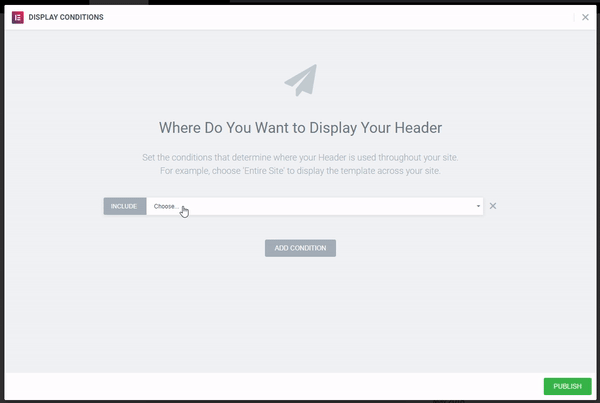
  5. Choose a Condition.

Custom code

With Elementor Pro, you can set custom CSS globally. This allows you to add custom CSS rules which will apply to your entire site.

Important! Additional CSS needs to be saved in the Site Settings > Custom CSS.

Important! All WooCommerce pages except for the Shop and the Single Product Page cannot be customed via Elementor. Please use the CSS already preset and add your own in Site Settings > Custom CSS.

How to use preview settings

For Theme Builder Templates you have the option to preview a specific product or archive. For example, to design a Blog or Shop, and to be able to see the content while designing, you can preview a product or an archive, from the Preview Settings.

  1. Click the gear icon in the lower left corner of the widget panel
  2. Go to Preview Settings and select what Dynamic Content you wish to preview

More information

For more information you can always press the Need Help button which is available on each widget.

Or you can always use the Help Center from Elementor.